Call to Action (CTA) buttons call to mind the expression “the devil is in the details”, because they seem like a small detail in the grand scheme of things, but in reality they have a huge impact on conversion rates. CTA buttons come in all shapes, sizes, colors and designs but only some of them are effective, only some of them get clicked on. Why? How can you design your CTA button to increase your conversion rates?
While CTA buttons seem simple, there is actually a lot of thought that goes into them. Tweet This! I will dissect the small CTA button into 5 elements and describe how to best adjust each to optimize conversion rates.
The 5 elements of a CTA button that affect conversion are:
1) Color
2) Placement
3) Shape
4) Size
5) Message
Through testing it is possible to know what combination of elements gains the most conversions. Now let’s examine each element in greater detail.
Color
CTA buttons should be a color that contrasts with the existing colors on the page. For many companies (and their designers) the first instinct is to match a CTA button with branding colors. This makes a lot of sense logically, but logic doesn’t always increase conversions. Sure, that button will look nice if it matches everything else on the page, but the job of CTA buttons isn’t to look nice and fit in. CTA buttons need to be the class clowns, the Tyrion Lannisters, the Fred and George Weasleys, the PETA demonstrators…they need to stand out, get your attention, convince you to take action. If you match your CTA button to your branding, it might blend in and get ignored. Instead of matching a CTA button to your branding, design it in a contrasting color so it stands out, like a flamingo in a gopher denTweet This! Don’t be the Waldo of the CTA button world.
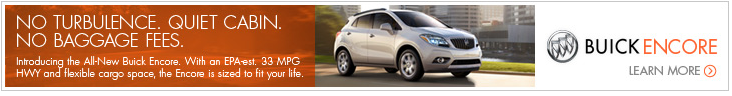
This Buick ad does not use a contrasting color for it’s CTA button, so “Learn More” blends into the ad. The arrow symbol inside the circle helps (plus it is orange, which is a contrasting color against the white) but overall this is too subtle to get noticed immediately. Conversion rates could probably be improved by making an orange button shape. Then the text “Learn More” and the accompanying arrow symbol could be colored white and would stand out more. While this design looks pretty, it probably isn’t optimized from a conversion standpoint.
Placement
CTA buttons should be surrounded by whitespace and they should be in a spot that is prominent, logical and easy to end up at. Here’s what I mean: if you want someone to give you their email address, then put the CTA button below the email address field on the form. Nobody should have to hunt around for it. Another key thing to remember is that the CTA button needs to be prominent. The entire point of whatever it is placed on is to get people to click on that one button, so design the entire piece (whether it’s a landing page, ad, etc.) with the CTA button in mind. Also, white space gives viewers’ eyes a chance to rest. People naturally look at things surrounded by blank space, so help people find your CTA button by giving it some defensible space. This also ensures that nothing else distracts the viewer from the CTA button. Know your audience; if you are catering to an American audience, then people read top-left to bottom-right. This means you should put your CTA button at the bottom-right where the reader will naturally end up.


Both of these ads are so cluttered that their buttons have no whitespace. As a consequence, they don’t stand out as something that a viewer should click on and click-through-rates (CTRs) are probably lower than they could be.Notice how both buttons contrast well with their backgrounds but because they are so crowded they still do not stand out.
Shape
CTA buttons are generally the same shape: rectangles with rounded corners. If you want your CTA button to stand out, wouldn’t it be a good idea to try something different?
Well actually, no.
Here’s why: CTA buttons need to make it obvious that they are a button. People are familiar with the typical, rounded-corner rectangle seen everywhere as an online button. Other shapes might make a viewer confused and it might not be obvious that the object is actually a button to be clicked on. Another way to make a button obvious is by designing it to look like a physical button in real life. Adding a drop shadow effect to a button shape helps make it obvious that the shape is clickable. On a more subconscious note, rounded corners draw the attention to the center of the shape, while sharp corners point away. So, with shape, stick to the good old rounded-corner rectangle. (and don’t forget to have a drop shadow!)

This FLVTO button is an unusual shape. While the design is unique, it has the potential to be confusing because it isn’t obvious that the shape is a button. It is fun to think outside the box, and as a designer I would be the last to say play it safe with a design, but when it comes to CTA buttons, you can’t argue with data and the data says unusual is confusing and traditional converts. Therefore, the marketer inside me wants to tell you to avoid unusual button shapes like this. If this was a more traditional square with rounded corners and a drop shadow, I would have no doubt that this is a button and neither would the visitors who you want conversions from.
Size
There is no perfect button dimension, so you’ll have to use your good judgement here. You want to get noticed, but not be obnoxious, the size should be appropriate to the circumstance and bigger isn’t always better. Make the CTA button big enough that all the text on the button fits well within the button shape and is easy to read. You also want your button to work well with the design of the form, landing page or ad it is designed for. While it needs to stand out, it should also be proportionate to its surroundings. Be Goldilocks and avoid having a Jack-and-the-giant-beanstalk button or a Thumbelina button.
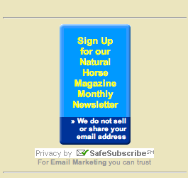 (Yes, this is an actual button I found.)This NaturalHorse.com button is excessively large. But seriously, at this point it is more of a tower than a button. Clearly, this button needs better proportions. It is so tall that it is no longer obvious it is even a button. No drop shadow can help solve that problem, this puppy needs to go back to the drawing board. Less text and a wider layout would help make it more obvious that this is a button, and it would also be easier on the reader, who isn’t going to hang around to read all the copy on that…umm…obelisk? To end on a positive note though, this button does establish an element of trust with the white text. By explaining their email address policy, people are encouraged to sign-up without the worry that giving away their email address will result in lots of spam.
Message
Be clear but concise. Anybody who takes a chance and clicks on a CTA button wants to know exactly what they will get. Also, leaving the default “Submit” or “Click here” is like using the default Times New Roman font in your writing applicationTweet This!. Just don’t do it. Take the extra couple of seconds (or minutes, I won’t judge) to think of some better text for your button. Action verbs help encourage people to take action (crazy, I know). Symbols like arrows can serve as an action-inducing element also so keep them in mind when working on that button copy.
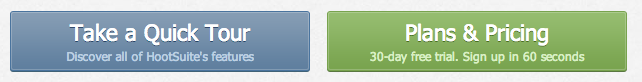
Hootsuite uses these two buttons next to each other on their site to promote the features and plans it offers. Both are clear about what will happen when you click on the button, both stand out, and both are written with text that isn’t default. Notice how the more active of the two in blue says “Take a Quick Tour”. “Take” is an action word and “Quick” implies it is easy to do and creates a sense of urgency. The green “Plans & Pricing” button uses less active copy but compensates for it with the smaller sub-text that says “free” and reassures you that it only takes 60 seconds.
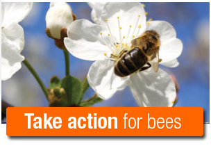
Why should you click on this button? For the bees people, for the bees. This Greenpeace CTA really represents the culture of Greenpeace well and seems very effective. It uses active copy and explains why you should click on the button. Another great element is their use of bold and regular text to demarcate the primary message. They want you to take action but also want to make it clear that it is for bees. The short, bold text gets read first and stands out in your brain while the rest of it supports the message without interfering.
Test
Most importantly, none of these design tips are worth anything if you don’t TEST. Without hard data to back up each little change in a CTA button design, it is impossible to tell the difference between what you think is working and what actually is working.
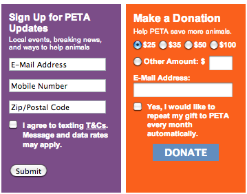 These are two forms found on the PETA website. They would be great to test conversion rates with because they are both very different. They are different colors, ask for different information with different styles of entry (radio buttons vs text) and the buttons are different shapes with different text. Testing which of these two is more effective would be a good starting point for CTA design, but I also chose to show these two together to illustrate another point. Even small changes can have a big effect on conversion rates, so the best way to test is by tweaking one small element at a time and monitoring the difference in conversion rates before and after the change. Here there are so many differences that if one received dramatically more clicks than the other, it wouldn’t be immediately apparent why and why is a key piece of knowledge for conversion rates.
Even seemingly minor changes, like an exclamation mark or the addition of a drop shadow can have a measurable impact on the effectiveness of a CTA button design. A/B testing is the best way to know what is increasing conversions and what is just a waste of your designer’s time.
WWMD? (What Would Mom Do?)
These best practices can help guide your next CTA button design in the right direction. If you are concerned with your conversion metrics or CTRs, try implementing some of the advice given here to improve the effectiveness of your design. By changing a few elements at a time and testing the success of each design, you can incrementally improve your conversion rates and get a sense of what your audience prefers. A rule of thumb I like to use is this: if you think your mom would click on it, you’re probably doing it right.
